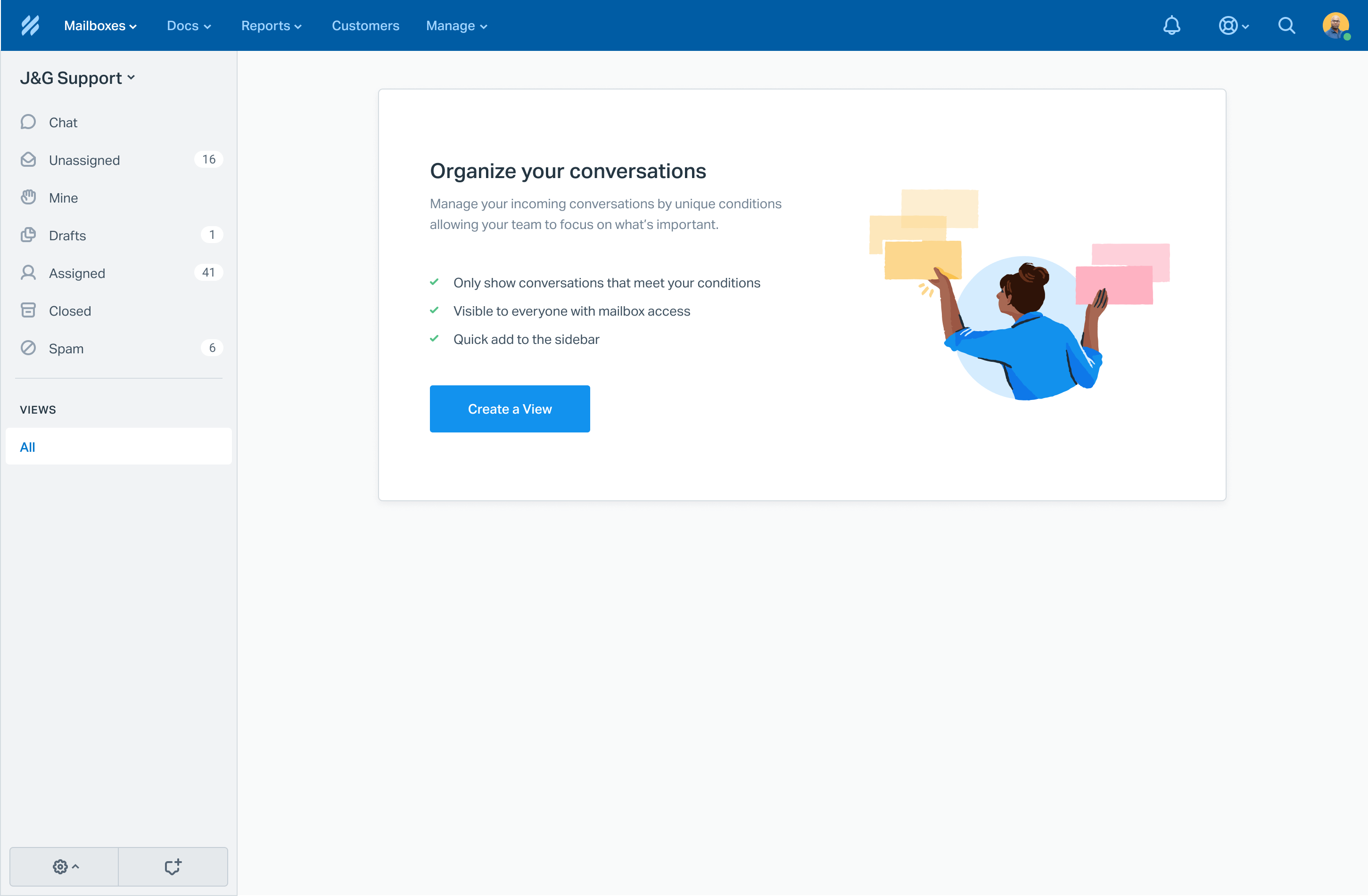
Views
About Help Scout
Help Scout is a customer support platform — a single place where phone, email and chat communication is directed. Much like Zendesk or Intercom. The key difference is that Help Scout prioritizes human-centered conversations and aims to facilitate world-class support. Our customers are drawn to the platform because they’re not “bots”, and their customers aren’t “tickets”.
How it started Direct link
The motivation for this project was fairly intrinsic — help customers build better queries when using our existing automation tools.
The problem
IF subject contains refunds or returnsTHEN Do something
Customers were creating queries like this, which was causing problems — apparently the operator "contains" is an expensive question for a database. If we could change it to "equals", maybe all our problems would go away. Right?
Leadership suspected that the answer might be a little more nuanced. So my task was to consider whether there was a way for people to achieve a similar level of conditional automation without the need for overly-complex queries. What happened next changed the way the company designs products.
Research Direct link
We started by crunching some numbers to understand how people were currenrly using automation. We found that ~80% of the time, customers were writing rules simply to direct incoming conversations. For example all emails relating to "Refunds & Returns" going to a folder.
Immediately our research indicated that customers needed a much simpler way to achieve that easy organization — a way that didn't involve writing rules and queries. If you opened your laptop to 1000 unread emails, you'd want a way to do the same — quickly and with confidence.
Unfortunately our data couldn't provide any insight on how teams liked to sort their work. So alongside my PM, I spoke to a wide range of customers to understand their specific needs. I wanted to know how they tackled their work.

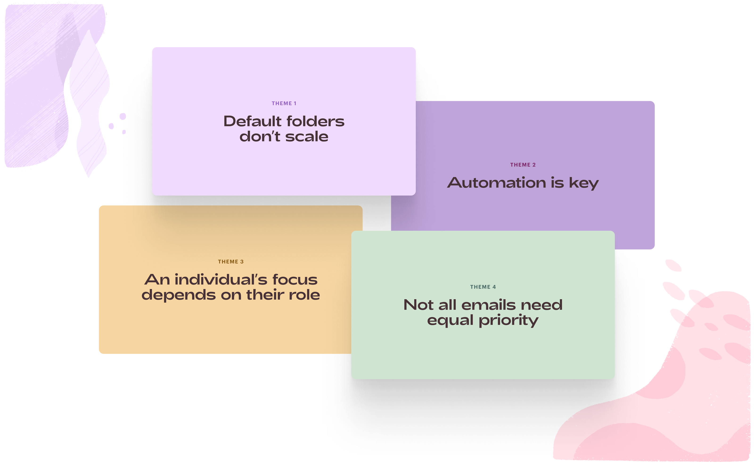
It was facinating. I spoke to a movie production company 🍿 who needed to prioritize conversations that came from Marvel, but Paramount could wait a little longer. A flour manufacturer 🍞 who split general baking enquiries from a very urgent product recall event. An online commerce business 🛍️ who received tens-of-thousands of emails a day, but only their high-profile sellers needed attention. A hosting platform 🤓 who directed very technical questions to their experts. The list goes on.
The common theme was that every company works in a unique way and tends to split work to mirror their team or business structure. Customers want rules to organize work by priority, customer type, topic, channel or some other dimension… then the ability to direct items to specialised teams, shift workers, specific folders and more.
This research, combined with data analysis, customer complaints and what we already knew — I split the problem into these key areas of interest:
The pitch Direct link
I love a good analogy — an oversimplification or abstraction of a big problem that can easily align the team on why a solution is necessary. In this case I illustrated the idea of teams needing to sort through massive piles of
So I packaged up the research findings into some cute illustrations centered around how teams need tools to order, segment and organize their work depending on the nature and size of their organization.
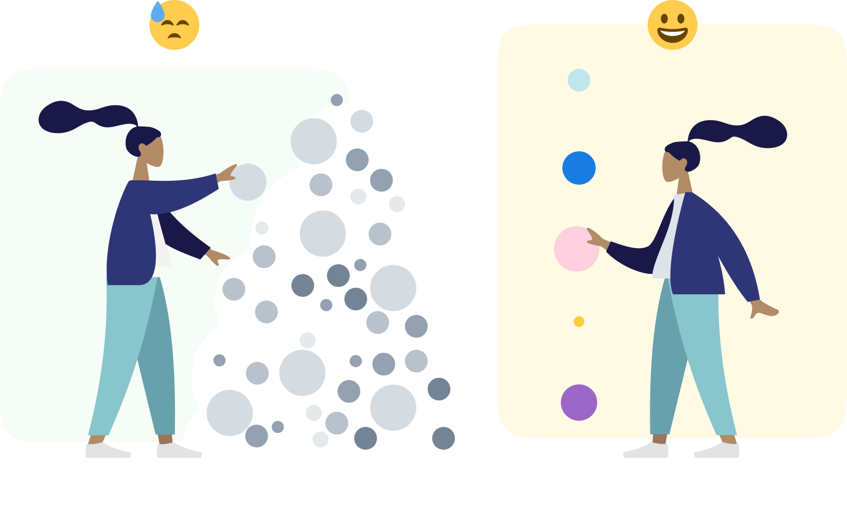
Whilst this might have been a (gross) oversimplification, the engineering team were really receptive — and were able to get excited about the opportunity to build a better and more useful customer solution.
Discovery Direct link
As with all projects at Help Scout, this one was collaborative and remote-first — the notable difference here was that I wanted to involve the entire design team in the early stage concepts. Creating a new feature requires many minds.
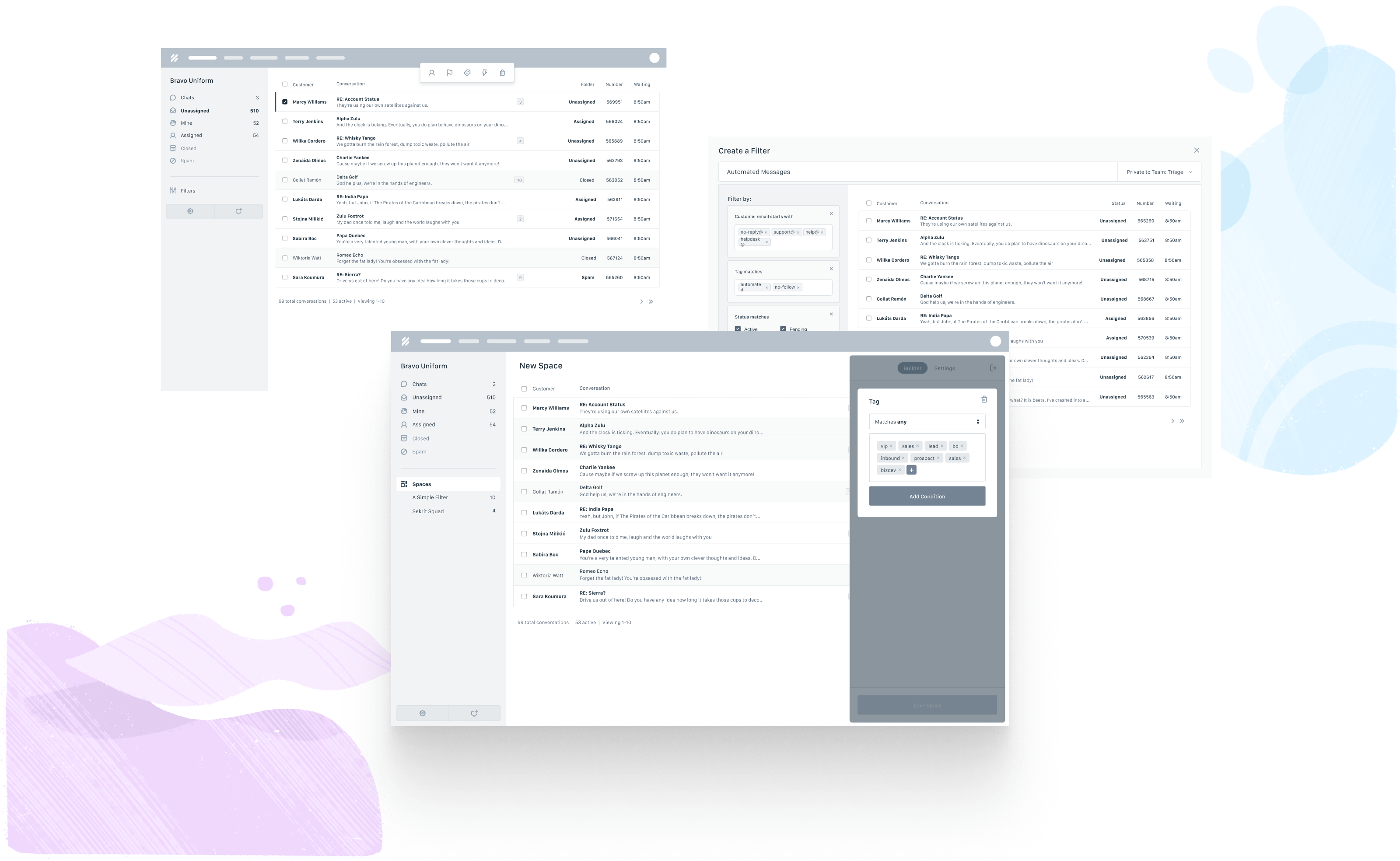
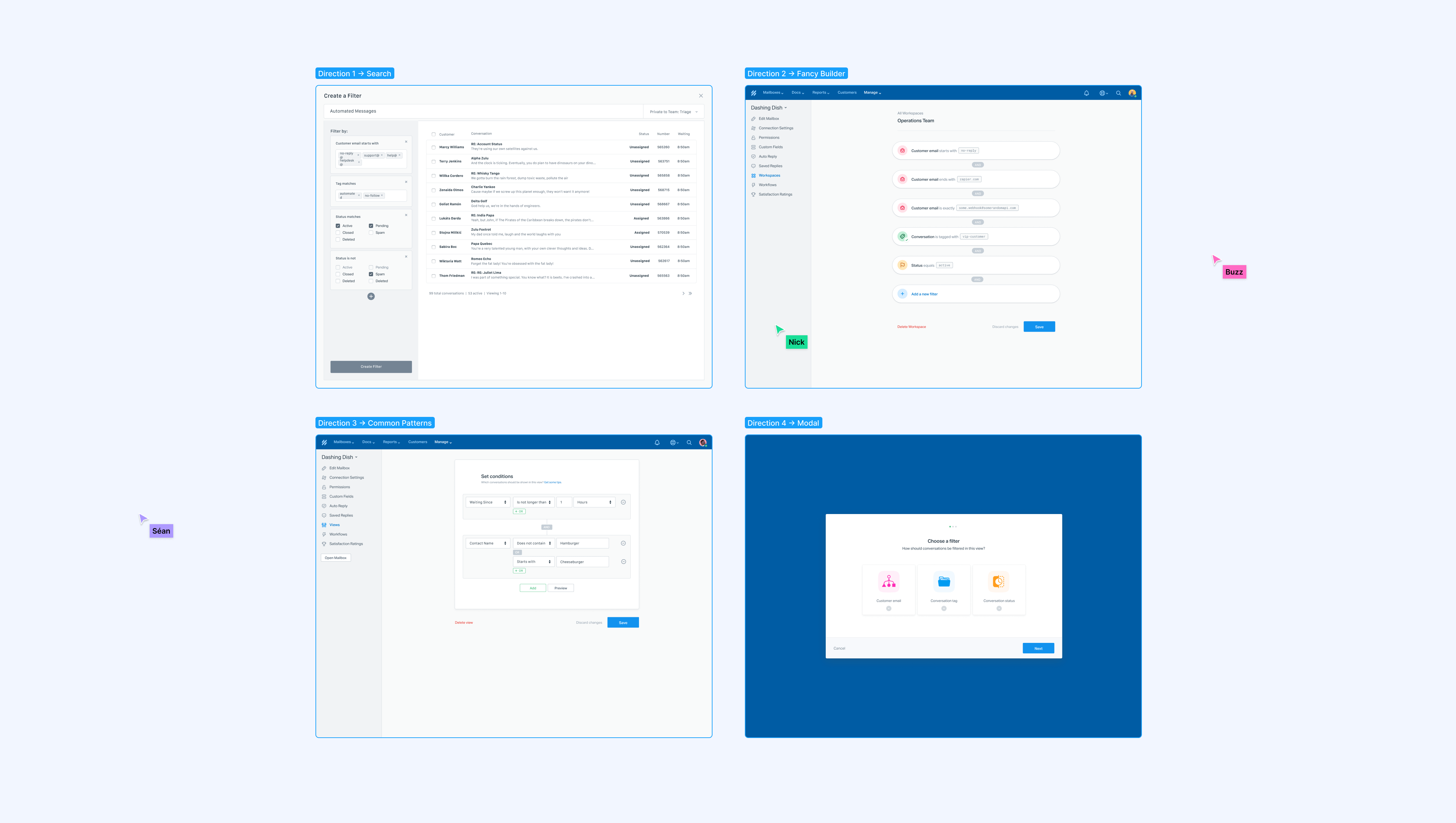
I pulled together some quick inspiration, a discussion guide and a bunch of wireframes — and we designed a few different creative approaches together in realtime.
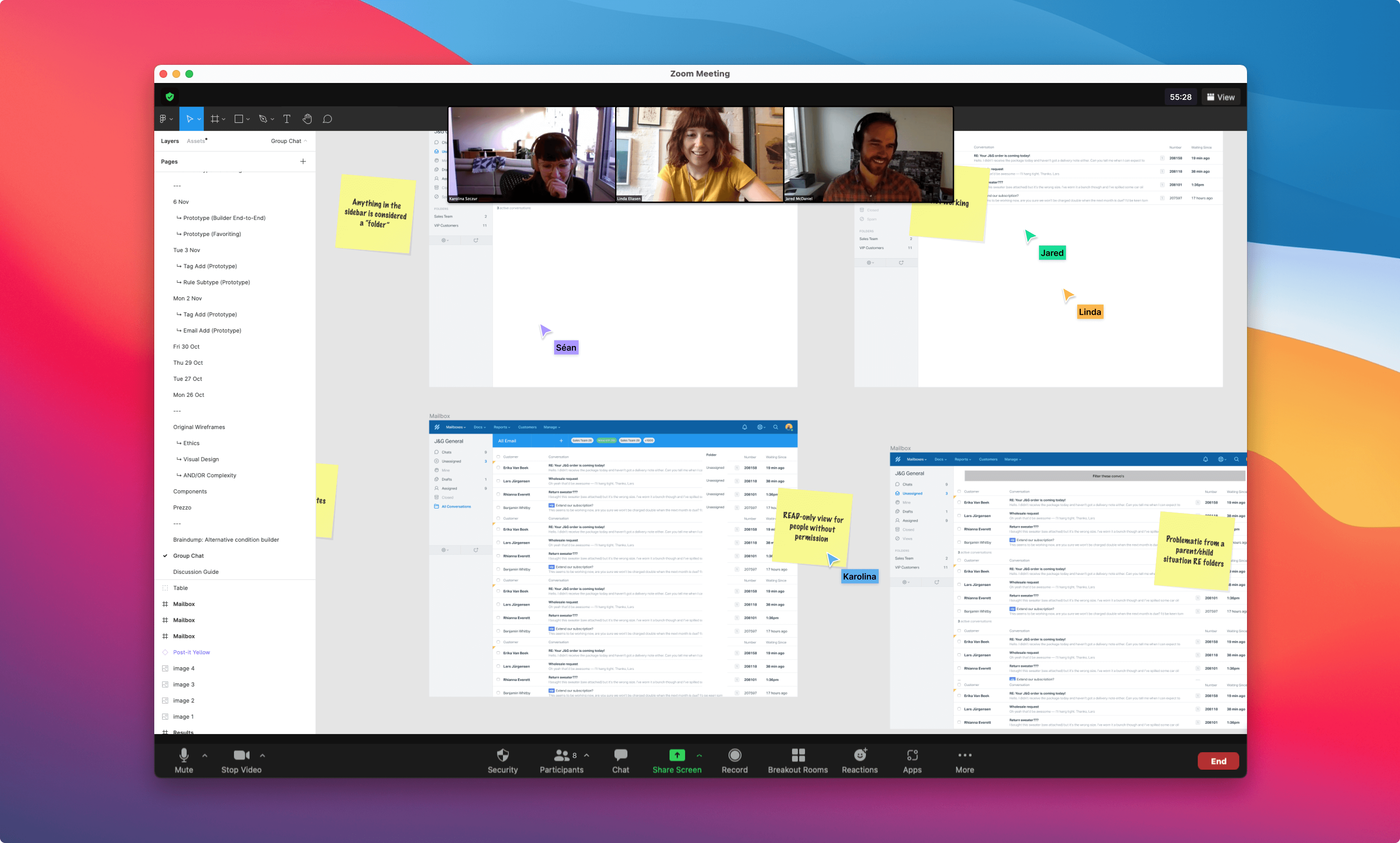
There was a lot of time saved by discussing concepts together early on in the process — amongst other benefits it gave a shared context and made subsequent feedback more relevant. Plus it’s always fun to use Figma’s collaboration tools.
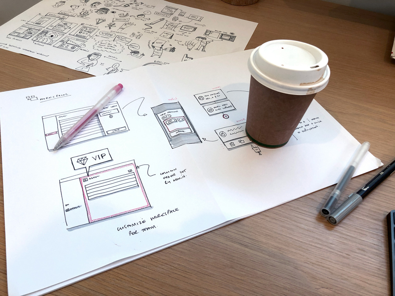
Sketching makes a big part of my process in the early stages too (as does coffee). For me pen and paper is an opportunity to get ideas out of my head without getting bogged down with pixels and design systems. More UI sketches here
Then of course the sketches become wireframes, which were shared amongst the team at regular intervals — and occasionally user tested when I came to a point where a hypothesis was formed, or there was a point of indecision.
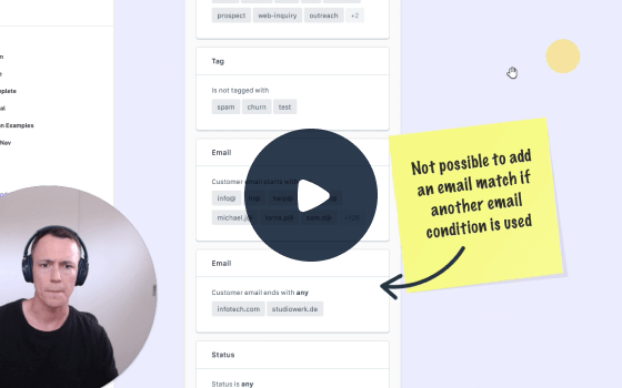
Being in an entirely different hemisphere to my team, I leaned a lot on asynchronous communication to explain my progress and ideas — Loom being one of my most frequently-used tools. Videos accompanied by Dropbox Paper is still — for me — the best way to share daily updates and communicate progress with the team.
A discovery phase for a project like this is long, requires lots of concepts that go nowhere, and a decent amount of user-testing to validate or disprove some assumptions. This project was no different, but the journey highlighted some key desires that I wanted from the final designs:
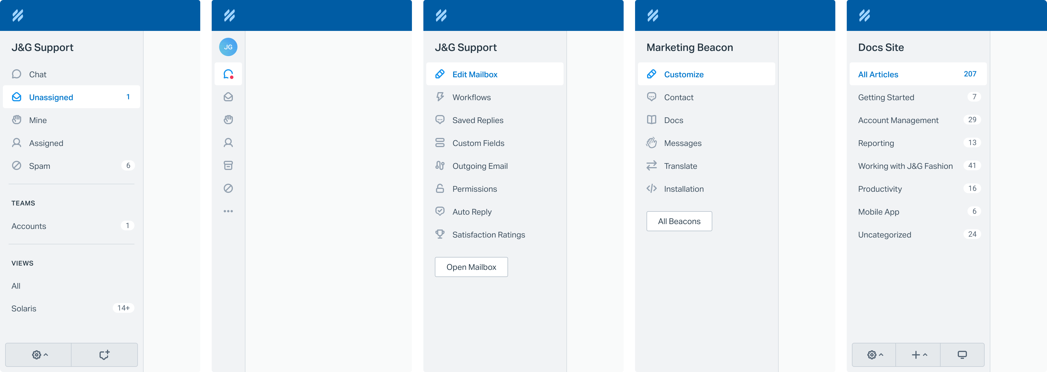
- Requiring customers to write database queries doesn’t scale.
- Organizing conversations should happen where the conversations do.
- Any team size should find value in this.
- Automation should be fun and empowering.
Visual Design Direct link
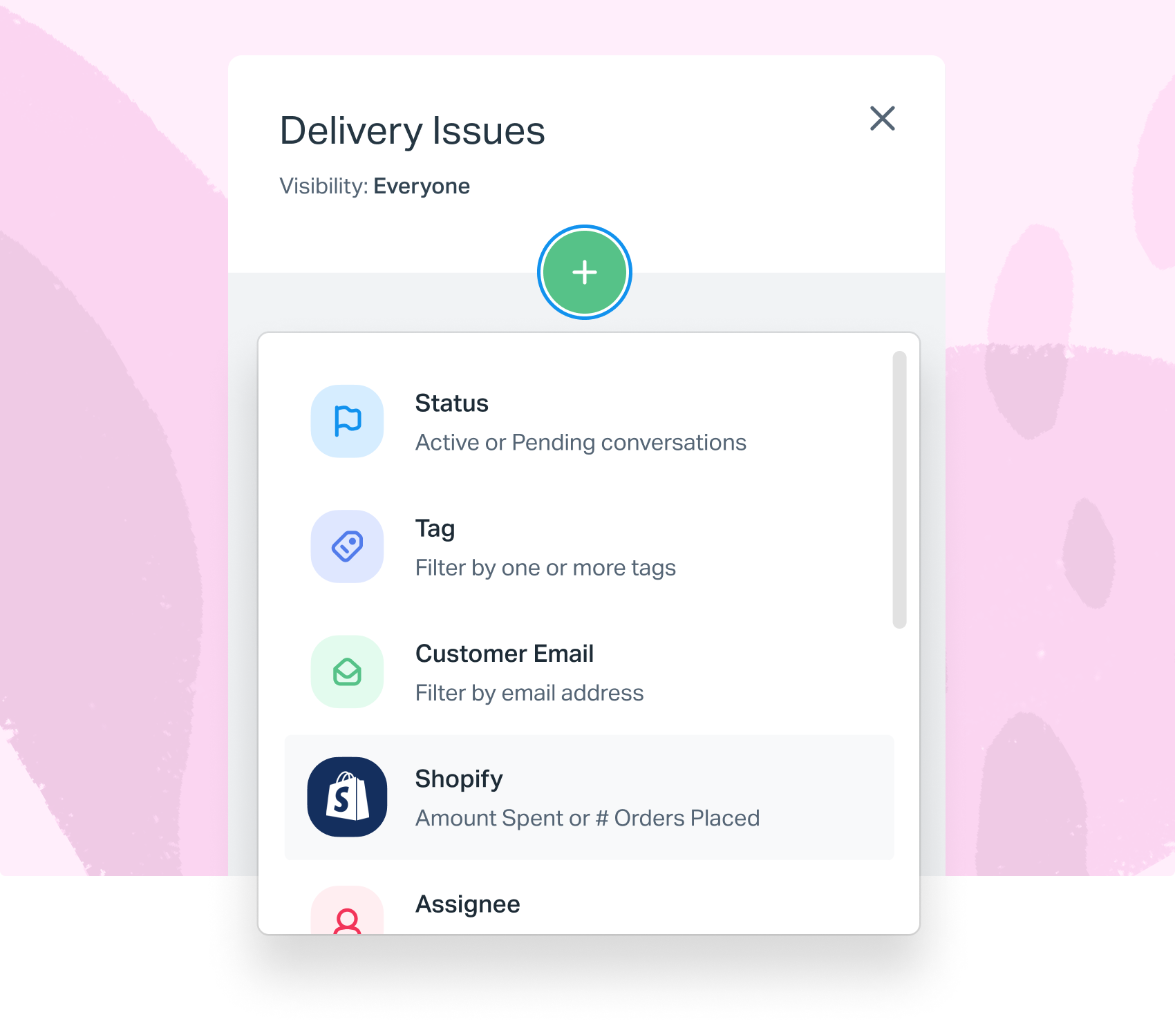
Say hello to Views. I ended up creating a WYSIWYG builder which is designed to overlay the existing folders users are already familiar with. It’s fun to use, restrictive in the options it provides, yet still services +90% use-cases.
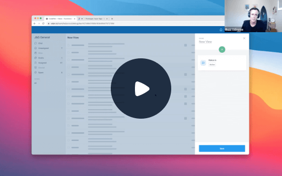
I created prototypes like the one above (play with the demo) to get a feel for the interactions, which were also useful for user-testing. Functional prototypes like this uncovered a lot of usability issues that might not have surfaced until launch.
This project was also an opportunity to have some fun with interactions, animations and create re-usable components that could inject a bit more life into the product outside of this feature. The popover styles and depth from these designs have since made their way to other new features.
Status Direct link
The big full release is set for mid–2022.
In the meantime… the research for this project helped identify other smaller areas of opportunity which didn’t require so much engineering effort. One popular addition we recently launched was a better way to assign data to customers, an improvement I designed using a lot of the patterns and interactions I created for Views.
The upcoming addition of Views has also been a forcing function for rebuilding older parts of the app, like the global navigation. Since that was on the cards, I took it as an opportunity to make the sidebar fully accessible and responsive — that’s live now too.